WHY PLAYBOY?
When I was determining how I wanted to present my work, I realized I didn’t want it to be just your average portfolio. The main reason that I went into sex toy/object design in the first place was because I wanted to spread a message. I want to reframe the way that we think about pleasure, kinks, bondage, and just sex in general.
To do this I wanted to find an inspiration that had the foundations for this message.
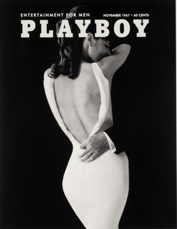
It all began when I was designing my physical portfolio, I was thinking about the cover and for some reason Playboy came to mind. Their iconic cover pages and what they represent lays the perfect groundwork for my intention. I want people who view my work and my portfolio to see what Playboy isn’t: passion, pleasure, and real bodies. When put in the context of this iconic brand of misogyny, I hope that people are able to see how detrimental Playboy has been to how we view and discuss sexuality.
When I was considering the cover of my physical portoflio, the well-known cover of a woman in a white dress came to mind. Clean, sleek, and with opportunity for intimacy. The reason that I don’t define Playboy’s cover as intimiacy is because of how it is shot through the male gaze. The model is edited to be slender with a large butt, and the man is entirely cut out aside from his hand, which is undressing her behind her back. Though it is implied that there is consent here, I still don’t believe that this sets a good understanding for sexual interactions. This is not to say that having a coy, sneaky moment cannot be sexy, though setting this as a standard for intimacy is very male-centric and hardly focused on pleasure for anyone but the viewer and the man undressing the woman.
The photo that I chose to replace it with, holds sentimental value. When my parents were having my brother, they did a maternity shoot and framed one of the shots. This photo was on the wall of my house as I was growing up, so when I was thinking of a photo that represents intimacy in the way I desired, my mind led me back to this photo. This photo pictures a pregnant woman lovingly being held by her lover. The non-sexualization of intimacy makes this photo that much more perfect for me. Not to mention how it refuses to fetishize pregnant women, which are ususally only represented in some fetish context. Thanks to my parent’s generocity, I am able to use this photo on both my website and portfolio. I also believe this is a cute easter egg within my work, because it shows how understanding, kind, and supportive my parents have been as I explore being a sex product designer as well as my own sexuality and gender: not to mention how they are incredible role models for intimacy and love.
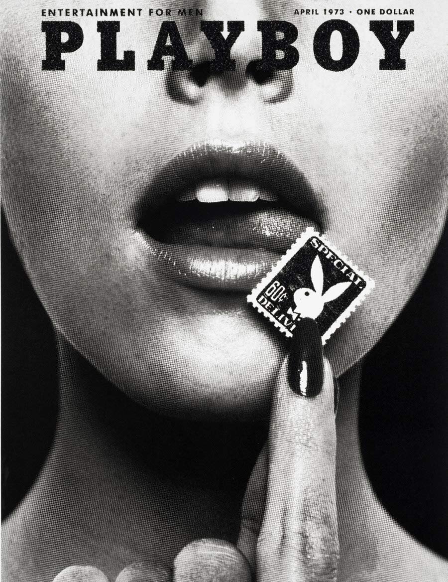
As I began ideating for my business card, I realized that I could make custom lube packets. Not only would this be a fun, stand-out card, but it also helps to subconsiously spread the word about how essential lube is for everyone. When I first started trying to find a manufacturer, I primarily found male condoms, this sparked the idea of making vaginal condoms be my business card, but because my work isn’t made just for people with vulvas, I stuck with the lube packets. When planning my design, I wanted to connect to my otherwise Playboy-related presentation of my work, and so I took some inspiration from the stamp seen on their April 1975 cover.

